As I mentioned in my first post on this new blog, this isn't my first rodeo with WordPress or blogging in general. I have actually used a number of different content management systems in the past like Drupal, older versions of WordPress, and even forum platforms like ProBoards, phpBB, and vBulletin.
All of these tools are amazingly simple to use in comparison to how much they offer to their users. However, this latest version of Wordpress (version 4.8) has been above an beyond a great experience.
I value the ability to make quick and accurate customization to my website, and with WordPress's huge library of plugins and their latest customization features like Additional CSS, it has been easier than ever to do just that. I wanted to share with you all a few of the specific customizations I made, and just how simple it was to do those things.
Adjusting the Social Links Footer
One of my top goals for this site was to have a single location for all of my various social media profiles. WordPress's new Social Links Menu makes it super easy to achieve this, however their default implementation was not very good looking in my opinion. Specifically, they made the 'social-navigation' section have a width of 36%, with a max-width of 1000px for the container. This means the menu can have at most 5 icons before wrapping to a second line, and even less if the window is smaller.

I wanted to fix this. I wanted the Social Links Menu to take the entire bottom footer space, and I also wanted the links to align right, so that it would be right underneath my Home Page text. This also meant I needed to get rid of the "Proudly powered by WordPress" text. I am not against giving credit where credit is due, but not if it means compromising a good look.
To achieve my goals, I made the following simple CSS update in the Additional CSS settings:
.site-info {
  display: none;
}
.social-navigation {
  width: 100%;
  text-align: right;
}
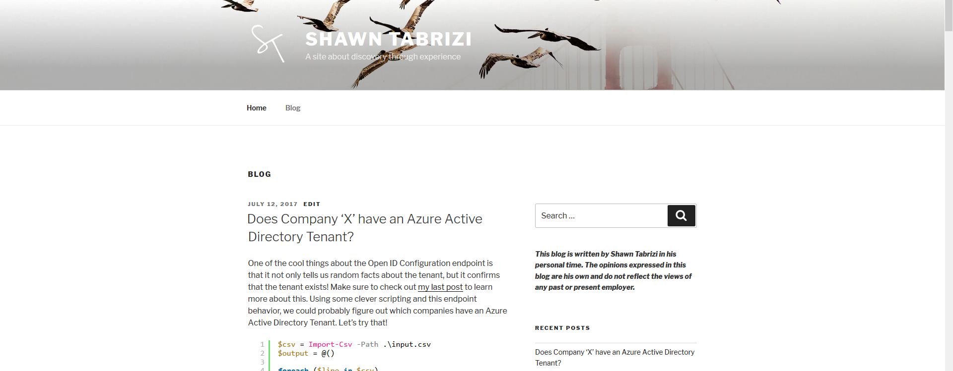
Here is the final result:
Increasing the max-width of the theme
Surprisingly, the twenty seventeen theme has a max-width of 1000px. We are in a generation of increasingly higher and higher resolution screens, and I think that 1000px was really choking the available space for a text based blog. I wanted to increase the amount of space used by the site to 1200px (+200px), so that my blog posts and code samples would be easier to read. To do this I made another CSS update on the Additional CSS settings:
.wrap {
  max-width: 1200px;
}
.navigation-top .wrap {
  max-width: 1200px;
}
This allowed me to change the base wrapper for most elements on the site to have a max width of 1200px, as well as the top navigation menu which adopted another parent style. The results were already great, but now the secondary content (which contains the blog sidebar) was taking too much space. The default setting for the twenty seventeen theme has the primary content take up 58% of the width, while the secondary content takes up 36% (with 6% spacing implicitly between the two). We added extra width to the overall content, but we really wanted all of that extra space to go to the primary content. So we simply need to update the percentages used to define the width for these two content divs:
@media screen and (min-width: 48em) {
  .has-sidebar:not(.error404) #primary {
    width: 68%;
  }
  .has-sidebar #secondary {
    width: 26%;
  }
}
Note that we only wanted to adjust the CSS when the viewport is large. At lower screen sizes, the responsive layout of the theme takes over and it looks good out of the box.
The final results look great:
Before:
After:
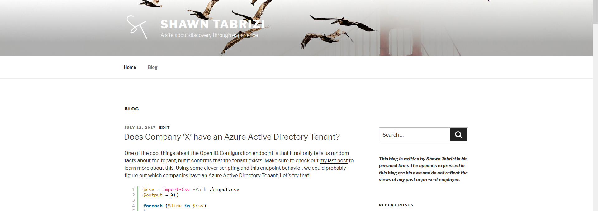
You can see my opening block of text which used to take 6 lines now only takes 4 lines. The difference is most notable when you look at the space between the primary and secondary content. You will see that it has significantly shifted to the right, while the primary content also extends further to the left. I think overall this makes the site look much better, and I might even consider increasing the max-width again.
Creating an About Me page as my Home Page
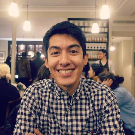
The last thing I wanted to do was to create a minimalist, yet good looking home page that would introduce me to the viewer, and act as a starting point for people to discover my site and other projects I might be working on. I needed a picture of myself, and a blurb about me. (If you have been paying attention, you will notice a sneak peak at the final result above.)
So what is the problem? Well, lets look at what the default theme does if you write some text and add an image:
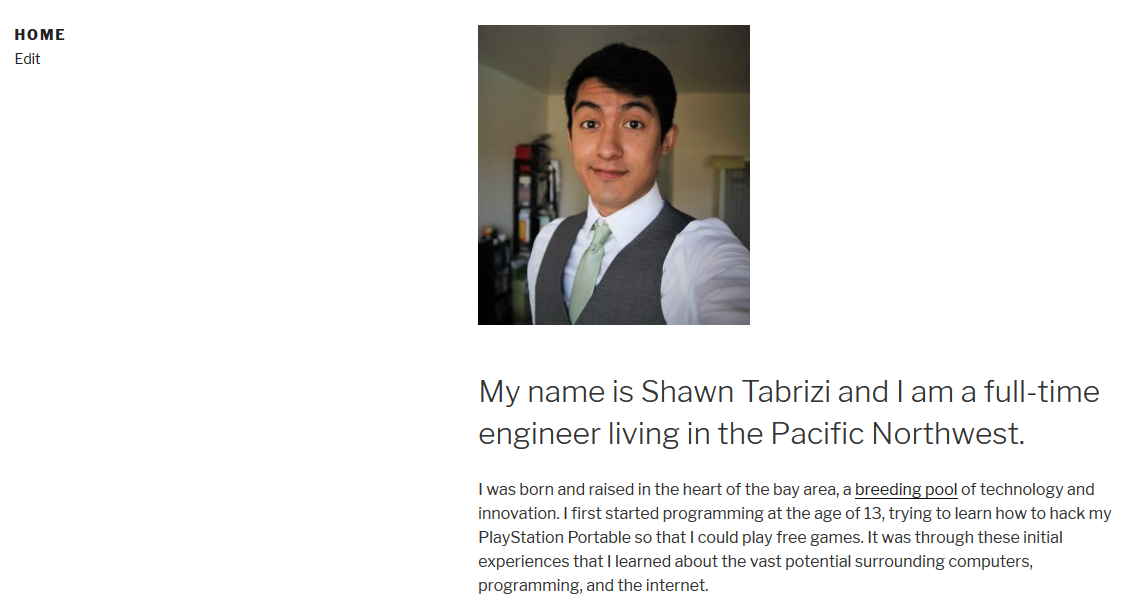
Ew. This is such an unbalanced use of space. The title of the page eats up nearly half of the page's overall space, and the picture forces the text off the screen, which creates a disconnect between my image and my bio. Wouldn't it be better to have the image in that empty space to the left? I found the easiest way to do this was to simply add the html as the title of the page.
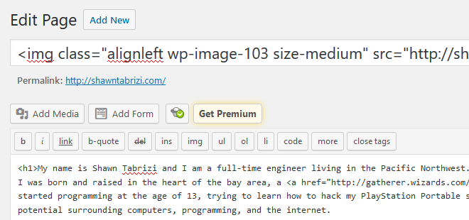
Which gives us the following result:
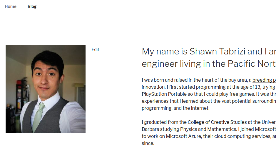
Much better! But I wanted to make a few more small tweaks. Lets make the image bigger, and lets make sure that it has no text alignment, so text doesn't start wrapping into it when the page changes size. Finally, I wanted to make the image an circle / oval rather than square. This is pretty common for bio pictures and quite easy to do, again using the Additional CSS settings. This was my final title:
<img
  class="img-circle wp-image-103 size-large alignnone"
  src="https://shawntabrizi.com/wordpress/wp-content/uploads/2017/07/19453121_1568143886560829_337872348308545095_o-927x1024.jpg"
  alt=""
  width="525"
  height="580"
/>
Note that I added a special class to the image called 'img-circle'. This points to a configuration in my Additional CSS which changes the border-radius to 50%.
Here is the final result:
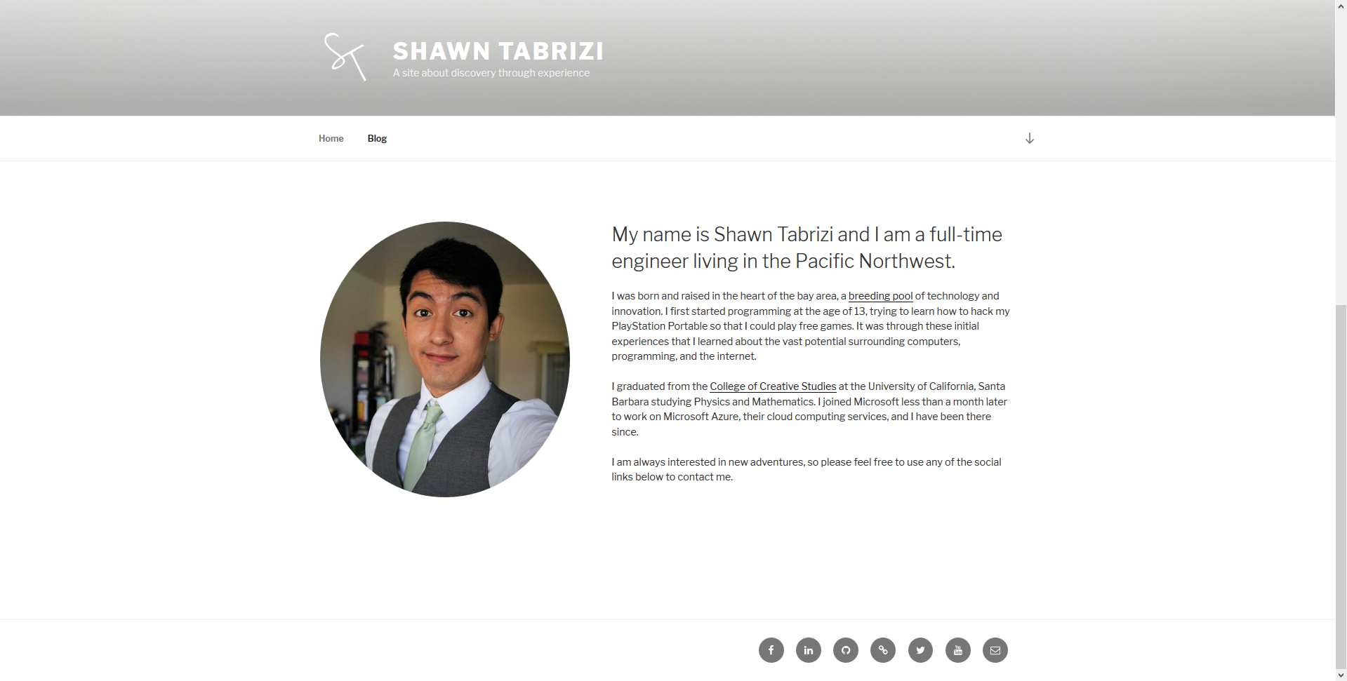
This was exactly what I was going for, and I think makes a slick home page for any personal site. I expect that I will continue to make a few smaller changes, adding additional styles to the page, but really this was the starting point I needed to feel comfortable with this page being on the web, and it was done almost entirely using the Additional CSS settings available in the latest version of WordPress. Just amazing how simple WordPress makes it for the end user.
Final CSS Settings
If you liked the changes I made, and would like to do the same to your own instance of the twenty seventeen theme, you can copy and paste this CSS into your Additional CSS settings:
.site-info {
  display: none;
}
.social-navigation {
  width: 100%;
  text-align: right;
}
.wrap {
  max-width: 1200px;
}
.navigation-top .wrap {
  max-width: 1200px;
}

@media screen and (min-width: 48em) {
  .has-sidebar:not(.error404) #primary {
    width: 68%;
  }
  .has-sidebar #secondary {
    width: 26%;
  }
}

.img-circle {
  border-radius: 50%;
}
Let me know if you found any other tricks or have iterated on the changes I made!